
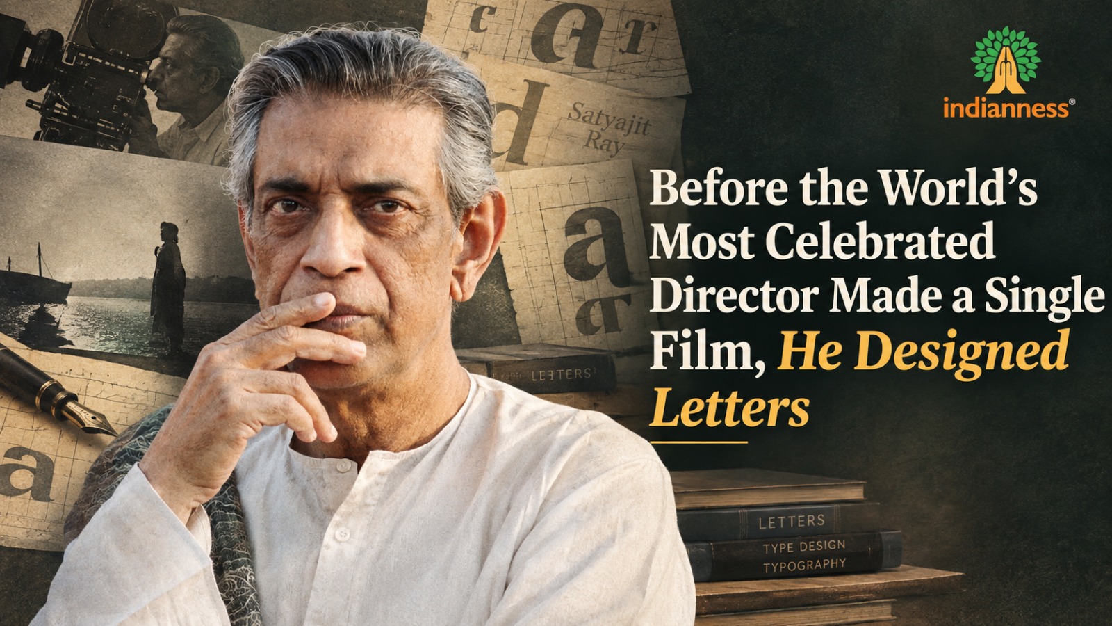
There’s a version of Satyajit Ray’s biography that most people encounter — the one that begins with a young man discovering his calling as a filmmaker and going on to become one of the most acclaimed directors in the history of world cinema. That version isn’t wrong, but it skips over more than a decade of his life spent doing something almost nobody associates with him at all: designing letters. Not films. Not stories. The literal shapes of individual letterforms — how a curve should bend, how much weight a line should carry, what a single word should feel like before anyone has even read what it says. Understanding that decade changes how you see everything he made afterward.
Ray was born in Kolkata in 1921 into a family with genuine artistic pedigree — his grandfather and father had both been respected writers, illustrators, and printers, and his father had founded a children’s magazine, Sandesh, that combined storytelling with distinctive illustration in a way that clearly shaped Ray’s own visual instincts from childhood. Ray initially enrolled to study painting at Visva-Bharati University in Santiniketan, the institution founded by the poet Rabindranath Tagore — about as prestigious an artistic pedigree as India could offer at the time — but he left before completing the course, unconvinced that fine art painting was actually the thing he was meant to be doing. It’s a small but telling detail: even at the very start, Ray seems to have trusted his own sense of misfit over an obviously respectable path laid out in front of him.
Thirteen Quiet Years Learning to See, Before Anyone Knew He’d Direct
In 1943, Ray took a job at D.J. Keymer, a British-run advertising agency in Kolkata that would later be absorbed into what became Ogilvy & Mather, starting out as a junior “visualiser” — the industry term for someone whose job is to translate an abstract advertising concept into something the eye can actually take in. He stayed there for thirteen years. Thirteen years is not a brief detour or a day job endured while waiting for a real career to begin. It overlapped almost entirely with the period during which he was quietly planning his first film. Whatever cinematic instinct people later praised in Ray’s work, it was being built, day after day, inside an advertising agency, long before a single frame of his films had been shot.
Alongside that agency work, Ray also took on freelance book-cover design and illustration for Signet Press, a publishing house run by D.K. Gupta, a former colleague. It was through this side work — work he almost certainly didn’t think of as career-defining at the time — that Ray first encountered the novel “Pather Panchali” by Bibhutibhushan Bandyopadhyay. He’d been asked simply to illustrate an abridged edition of it. Gupta reportedly told him, almost in passing, that the story would make a good film. It became Ray’s directorial debut in 1955 and one of the most celebrated films in the entire history of cinema. It’s worth sitting with how contingent that origin actually was — a freelance illustration job, a publisher’s offhand comment, and an entire filmmaking career quietly set in motion.
When No Letter on Earth Could Carry the Feeling a Book Needed
Ray’s specific fixation within design was typography — the visual design of lettering itself, a discipline most people never think about at all, precisely because it’s doing its job correctly when it goes unnoticed. Working on book covers, he kept running into a very specific, very practical frustration: the printed typefaces available to him at the time, in both Bengali and English, simply didn’t convey the particular mood a given book called for. A collection of dark, brooding modern Bengali poetry needed letters that felt dark and brooding. No typeface on hand did.
His response to that frustration wasn’t to compromise and use what was available. It was to design new letterforms by hand, drawing on a lifelong interest in calligraphy and weaving in Indian visual motifs alongside otherwise Western typographic conventions. Think about the sheer patience that requires — sitting with the shape of a single letter for hours, adjusting a curve by some nearly imperceptible amount, until the character on the page finally feels like it belongs to the story sitting underneath it. Over the following decades, this obsession escalated into something far more technically demanding: Ray designed complete original typefaces from scratch, a discipline with its own exacting rules about consistency, legibility, and rhythm across an entire alphabet. He created four typefaces for the Roman alphabet — named Ray Roman, Ray Bizarre, Daphnis, and Holiday Script — alongside numerous original typefaces for the Bengali script. Two of his Roman typefaces won recognition in an international type design competition in 1971, a genuinely rare instance of a film director receiving formal, competitive recognition as a type designer in his own right, in a field entirely separate from the one that made him famous.
The Director Who Never Let Go of His Own Posters
This design background didn’t stay quietly confined to his pre-film life; it stayed visibly, unmistakably embedded in how he made films for the rest of his career. Ray designed the posters, billboards, publicity material, and on-screen title cards for his own films — a degree of direct creative control over promotional and title design that is genuinely unusual among major directors, the overwhelming majority of whom hand that entire category of work off to separate marketing teams or art departments without a second thought. He also designed the logos of several important Indian cultural institutions, including the Sahitya Akademi, India’s National Academy of Letters, and the original cover for Jawaharlal Nehru’s book “The Discovery of India” — objects that countless people encountered without ever knowing the same hand behind them had also directed some of the most acclaimed films in cinema history.
In 1961, Ray revived Sandesh, the children’s magazine his own grandfather had founded, which had gone dormant after his father’s early death decades earlier. He wrote extensively for it, illustrated it himself, and used it as an ongoing outlet for the same visual sensibility running quietly beneath his film work. Across the full span of his career, he is estimated to have produced more than 5,500 individual book covers, posters, advertisements, and title designs — a body of visual work that, on its own, would represent a significant career for almost anyone, and that most of the world simply never connects to the name attached to his films.
Why the Designer Explains the Filmmaker Completely
Understanding Ray’s design background genuinely changes how his films read. The meticulous visual composition that critics have long praised, the careful and deliberate attention to text and lettering within individual frames, the strong, unmistakable sense of visual mood running through his work — these weren’t instincts that simply arrived, fully formed, the moment he first picked up a camera. They were skills he had already spent more than a decade deliberately, patiently refining in a completely different medium, largely unnoticed, long before the world had any reason to be paying attention. The industrial designer hidden inside the filmmaker wasn’t a curious side note to his genius. In a very real sense, it was the foundation the rest of it was quietly built on top of.
Sources: Satyajit Ray Society archival materials on his advertising and design career; Fonts In Use type-design archive; contemporary accounts of his work at D.J. Keymer and Signet Press.